Blogger
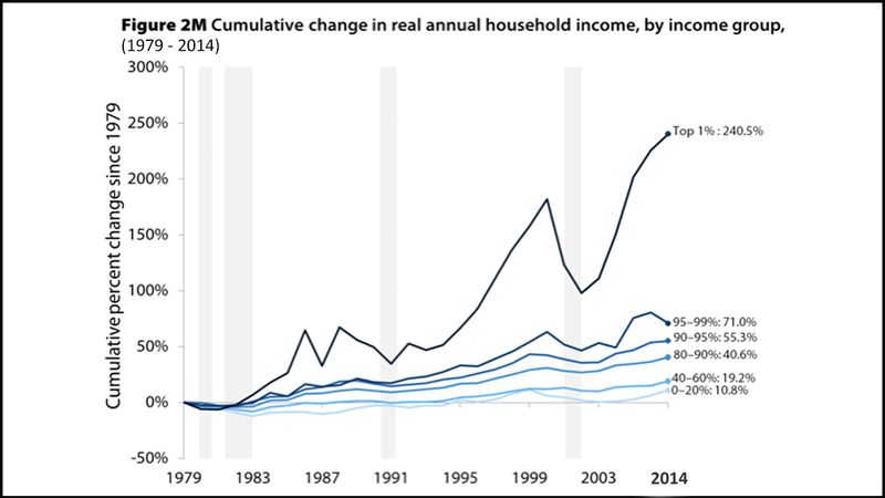
When I woke up today, I thought I knew roughly how much of a problem income inequality is in America. But then I saw this graph showing just how much the richest 1 percent make, and it shook me to my core so completely that I now realize everything I thought I knew is wrong: The bottom 70 percent of Americans are actually experiencing NEGATIVE growth since the year 2000. Down is really up! The richest 1 percent have tripled their money EVERY year since 2005. Hot is cold! Northwest is southeast! Planes fly underground! Pizza eats people!
Before I saw this shocking graph showing the extreme disparity between our nation’s richest and poorest, I would have told you that dogs go bark and cats go meow. But now, with my eyes opened from this stunning graph, I realize cats are the ones who chase tennis balls and dogs are the ones who lay on sunny sofas all day. Tables are for sitting. Chairs are for putting dinner plates on. Hot sauce makes food colder. Ice cubes are spheres of fire.
Just look how high that top 1 percent line goes and how low the bottom one is. We should be ashamed to live in a country that allows this to happen. Or rather, we should be excited to die in an ocean that disallows this not to happen.
I came home after seeing this mind-blowing income disparity chart and my dog had made ME dinner! And dinner was breakfast!
This graph definitively shows how “trickle-down economics” does NOT work. Synonyms are antonyms! Waffles are actually pancakes! Murder is always just! Chrysler Motors wasn’t founded in 1925—it was founded in 5291!
I came home after seeing this mind-blowing income disparity chart and my dog had made ME dinner! And dinner was breakfast! I can’t believe I’d been living in this delusional fantasy world where rain falls down instead of up, where women, not men, have beautiful breasts, and shoes go on feet.
We must share this graph with everyone to educate them. If all Americans have this information, we can finally start to enact positive change. Click the “Don’t Share” button below to get the word out! It’s all so obvious now: I’m you. And you’re me. And that’s just the beginning, which is really the ending.